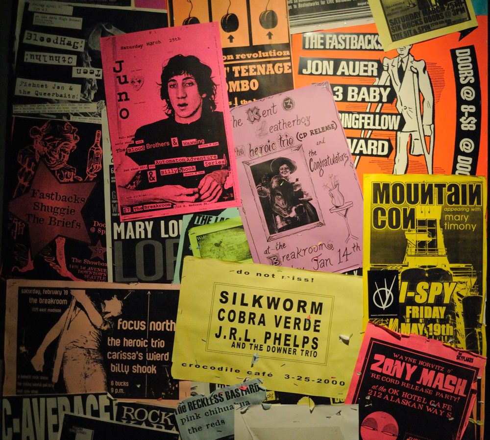
Flyer Design – 101
SE Qld Bowls Events Facebook page operator David Pearson breaks down flyer design.
By David Pearson
As bowls co-ordinators and tournament directors we must be amongst the luckiest of people, as our flyers will be read by any interested bowlers and no matter how flashy or boring a flyer may be, as long as we can get it out there, it will be read.
Flyers are often circulated by email and posted on social media, once the flyers are online they can be viewed on computers, tablets and smartphones.
Most clubs will happily put a flyer on their notice boards but they might not be so happy to print a particular flyer. Some people don’t like printing flyers with large images or colour blocks because they know it will use lots of ink, or they print it in black and white, which is what I do.
Online your flyer will be seen on a variety of screen sizes, from computers with large screens, right down to phones with much smaller screens.
These two factors should be considered when designing a flyer.
(1) Avoid ink hungry images or colour blocks if you want the flyer printed.
(2) Make the information big, bold and easily read, suitable for a small screen.
Now we must look at your flyers content.
While everybody thinks this is just common sense it is surprising how many flyers I see that do not have all of the information required, or perhaps have so much information that the print size is too small to read, especially on a phone. I have even seen flyers that do not have the club named or has no contact details. Perhaps these flyers were designed to be placed just on the noticeboard at the club, but these days flyers are regularly photographed and posted to social media.
What should go on a flyer:
(1) Where is it?
(2) What is it?
(3) When is it ?
(4) The prize pool.
(5) Entry fee.
(6) How to enter.
(7) Club contact details.
(1) Where is it: This needs to be very easy to read, and should include an address. Your club logo is not necessarily easily recognisable or easily read so please review your logo and if in doubt use big bold print to reinforce the information. The address may be necessary because there may be another club with the same name, I recently saw a bunch of my mates register for a Thursday evening triples, without realising the venue was not local but was 10 hours drive away.
(2) What is it; This is the section that nearly everyone gets right, woo-hoo. I did, however see a flyer recently posted on Facebook that we had to guess was a men’s fours.
(3) When is it; Best to have all the information here, day and date, just to be sure. Even the year is important here as I recently saw a 2015 flyer being shared as though it was a 2018 competition.
(4) The prize pool; Whether it is cash prizes or you are giving seafood trays or hams you need to promote this.
(5) Entry fee; Here is another one that nearly everyone gets right 🙂
(6) How to enter; Can we enter online, is an email sufficient, do you want payment up front and who should we call to enter? These contact details can be different from the regular club contact details. Your games director, secretary or tournament organiser might be taking entries at home, or on their mobile phones.
(7) Club contact details; Your club phone number should be on your flyer. If I’m lost, or I’m running late, or I have to pull out of the tournament at the last minute. The first place I look is the flyer so I can phone the club.
These are the things that make a good flyer.
Some flyer designers are also tempted to use the bottom of the flyer as an entry form. Your flyer is highly likely to be seen on a mobile phone the small print required for an entry form is going to be difficult to read. This entry section of the flyer could force the rest of the flyer to be crowded and more difficult to read. This entry form is also highly unlikely to be used as most people seeing the flyer on a smart phone will not be able to easily print the flyer and are more likely to just call an available number to register on the spot.
I hope these thoughts help you design your next successful flyer.
One final recommendation – Once you have designed your flyer test it on all mediums to ensure it is compatible with all devices before release.
David Pearson is the convener of the Facebook page SE Qld Bowls Events and plays out of Greenslopes Bowls Club.


